This first page is based off an exclusive sketch that comes with the kit!
I focused on the tags on this page and tried to do something a little different by matching them up with patterned papers to make them "blend" in. You can see that I took some red paper and created some chevrons to match the ones on the tag.
I also did it on this blue tag as well. Some circles and die cut starts outlined with white faux stitching are just about all I used for embellishment. I also stitched a large frame on the page, too, with both real and faux stitching.
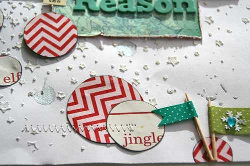
This next page is a bit different for me...because it has so many photos and they are arranged pretty linearly. But I didn't want it too look too linear, so I used a lot of areas of embellishment. I also didn't use a lot of patterned papers, and instead, misted the background with a bit of white and a stencil.
My favorite part about this page is the title. I used an app on my iPad called "sketch" and wrote the word "Christmas" with my finger. I saved it as a jpeg, emailed it to myself, opened it up in SCAL2 and traced it! Up, that is my handwriting! :)
I fussy cut some pointed circles from some of the papers and added some scalloped circles on top. I also cut some strips of ribbon and stitched them in rows on each side of my journaling block.
And that star piece is a leftover from the first layout above! :)
Another simple design on this next page. Just strips of distressed papers and stickers that I machine stitched over. I also added some tab stickers to different areas.
Behind the photo, I just used a credit card and white paint. I also LOVE the bits of white pom pom trim in this kit, so added some strips of those, too.
The last page I did was also based off of a sketch...it is todays sketch that is up on the My S&M sketch blog today. This sketch is by Kristine Davidson.
On the background, I used my star stencil from Studio Calico and some molding paste. I love the white on white and the texture it gave!
Then I just used some circles from patterned papers (strategically, I might add) and did some stitching here and there.
Phew...that was a LOT of pages with this kit! I actually have a few more projects that I made coming up over the next few weeks! Be sure to check out the My Scraps & More store for these wonderful kits!
Thanks!
AUDREY


These layouts are fantastic! LOVE the photo in that first one, just too cute, and I especially like the layout with all the strips of paper.
ReplyDeletebeautiful pages Audrey!! You rocked this kit!!!
ReplyDeleteAmazing layouts Audrey! Love all your details and techniques!
ReplyDeleteLots of great pages!
ReplyDeleteAudrey- GREAT LAYOUTS! Oh my- that beautiful baby with those gorgeous blue eyes is too cute...what an awesome photo. Love all the detail in your layouts...I have looked at them 3 times and still find something new to gander at...thank you for sharing!
ReplyDeleteGreat LO's!
ReplyDeleteincredible, inspiring layouts and omgosh his baby blues are just amazing!
ReplyDelete