Wednesday, September 30, 2015

Girl talk

Hello and happy Wednesday!
Lisa here today to share a page I created using Simple Stories So Fancy. I love this fun line! The colors and embellies are out of this world gorgeous!
I used a photo of my daughter and a few friends at Homecoming a few years back for this layout:


See what, did I tell you? Check out the colors- FABULOUS!
 
I added some Gelatos mixed with water and some navy mist spatters for my background.
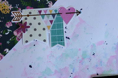
I love the banner, it came in the Bits & Pieces. I just added a bit of stitching and a flower to it:

 
The "Girl talk" card was fussy cut from a 6x6 paper. I love it!
Oh another thing I love about this line- they have bradz, but guess what? They don't have those nasty prongs that you have to poke through the paper! They just stick!

 
Here is a cluster of embellies from the Bits & Pieces pack. Check out the perfume bottle, lipstick, nail polish and yes, that gold arrow! SWOON!

 
Thanks for stopping by and have a great day!
 
Lisa

Tuesday, September 29, 2015

Pass It Along challenge.

Hello and good morning...

Happy Tuesday!!! One of the challenges that we play from time to time in the forum area is the Pass It Along challenge. One person starts with a page, then the next person asks for it- they lift it, and then it gets passed along to a new player. By the end of the month, it's fun to see the final result and how the last layout ends up looking from the original.

I started off the month with this layout, with a photo our of family (minus me) up at the Griffith Observatory. I used Echo Park's The Story of our Family collection kit.


The next player was Laurie and here is her page:


The layout got passed off to Jennifer and she made this layout:


It got handed off to Mandy and she created this page:


Then came Leslie and her take on it:


I then got passed off to Heather who came up with this layout:


Who then passed it along with Celeste:


And the layout made it's final stop off to fellow DT member, Lisa M for her take on it:


How fun is that to see the layout's progression??? Each month we play some kind of fun game in the forum, so make sure to see what's going on each month, and play along!!!

Thanks sooo much for stopping by and have a great day!!!!

Sunday, September 27, 2015

Remember Forever with American Crafts

Happy Sunday everyone! Today I am sharing a fun layout created using the amazingly fun new line from Documentary by Dear Lizzy for American Crafts. This is such a fun and playful line, that I found just perfect for a layout of my baby girl in utero.
How playful is that days of the week text paper; Mondays . I wanted to use it as a WOW background without it being over powering, and chose to use is as a small frame and adding another mating paper for my photo. I chose to offset the bold black and white paper with the soft yellow hearts pattern from the hello love paper.  I fussy cut a bunch of fun circle patterns including this "hello" text from the confetti paper.
I encircled my "hello" circle with my subtitle, created from some pale pink alpha stickers from Elles Studio. I also pulled these alphas at the top of my layout as baby girls name initials, and at the bottom of my page for the #4, as this is baby girl #4 for us! Creating my title, I used some foam scripted words and surrounded them around the most adorable cork bows.
 
I love how fun and happy this line is, just perfect for conveying my happiness and excitement for the arrival of baby girl in just a couple short months. Do check out the line in its entirety in the shop. There are so many fun paper patterns and embellishments to play with!
                                                                     Brianna

Saturday, September 26, 2015

Happy Fall

Hello and Happy Saturday!  It's officially fall and I am sharing a layout using Carta Bella's Fall Blessings!  I love the texture of their paper and the colors of this line are lovely!  Honestly, I can't choose which print is my favorite!


I used lovely dark wood grain print of the B side of Autumn Trees and Border Strips to layer my letters that I cut from The Cut Shoppe.  I added a beautiful chevron sticker from the 12x12 Element Stickers to accent my title! 


I am in love with the Fall Plaid print that I used as my background piece!  I also used a cut file from The Cut Shoppe to these some beautiful leaves from the B side of the Border Strips paper. 

I used some of smaller stickers to accent my page, as well as enamel dots from  my stash!


Thank you for stopping by today!  Check out the My Scraps and More Shop for this collection plus much more! Have a wonderful weekend!

Friday, September 25, 2015

Summer Snapshot

Hey friends!  It's Missy again, and I have a fun layout to share with you today.  I used the Echo Park Creative Agenda to create this page for last week's Mix it Up Monday Challenge over on our forums.  The challenge was to use patterned paper as a background, use at least five arrows and create a sideways title.

I found this awesome cut file from The Cut Shoppe.  I cut it in white cardstock and then used lots of patterned papers to back each of the open spots.  Then I stitched through each row.  This is such a fun technique to use for a fun background element.  Next, I added layers behind my photo and played around with all of the coordinating embellishments.


Backing die cuts is super easy...plus it gives you the opportunity to get lots of different patterns and colors on your page without it being too busy.  I added a little bit of journaling at the bottom.


I cut this cute pie chart out from the cut apart sheet in the collection and used it as a layer. I love that it has a rainbow of colors on it.  I also layered a few stickers right onto my photo.


Here's a shot of the big sideways title.  I cut "snapshot" in white cardstock on my Cameo and paired it up with the teal stickers on the sticker sheet.  I love the tone-on-tone effect of the teal shades.  I added a little bit of the coordinating washi tape and a cute camera sticker.  I finished it off with lots of yellow stitching.


Do you like using pop dots?  I think they add so much to the average embellishment.  Not that this is average...I happen to LOVE this rainbow circle!  But look at the dimension it gives from being raised up.  I think it adds so much to the design!


Thanks so much for stopping by today!  I hope you have a great weekend!

Missy :)

Thursday, September 24, 2015

Creative Agenda Fun

I just love the Creative Agenda line from Echo Park Paper!  The fun bright colors and phrases make it so versatile for just about anything.  I was inspired by the sticker at the bottom left "you are my favorite work of art" to use these photos of my daughter with her slushy blue tongue!  The pushpin stickers made me think of  pinning the photos to the page so I designed it to look like I had a line of photos hung from the twine.


I cut pop dots in half to give them a little dimension.  The cell phone was fussy cut from a 3 x 4 journaling card and I added the stickers for some fun. The alphas that came in the collection kit were perfect for a multi "font" title, too :)  So much fun!


Wednesday, September 23, 2015

Fancy!

Hey there!
Lisa here today to share a layout I created using Simple Stories So Fancy. Yup, I love this line! What more can I say?!


I used a stencil, modeling paste, watercolors and mist for my background.
I then added layers using papers from the 6x6 paper pad, frames and bits & pieces


                                            Love the bits & pieces of gold in this collection!


I closer look at the layers:


I hope you have a fantastic day!

Lisa

Tuesday, September 22, 2015

National Donut Day.

Hello and good morning...

Happy Tuesday!!!

I am always a sucker and drawn towards any of the Amy Tan lines, and this one was no different. Tons of fun, bright patterns and mixes of colors. This line is super happy and playful and I feel like pages just flow together when I use her lines. I used the Finders Keepers collection for this page of my lil one and her special picked out donut on National Donut Day. If you can't tell, she is pretty dang excited!!!


I fussy cut several of the triangle patterns from the Pursuit paper and added them through out the page:


And added several of the Puffy Sticker embellies randomly on the layout, along with some enamels:


I also used a few of the border strips and cut them out and added them:


I can't tell ya just how fun this collection is, and would work for so many different projects. I love that she adds boy and girl papers in there, so I can scrap both with the line..  So make sure to check out Finders Keepers.

Thanks sooo much for stopping by and have a great day!!!!

Sunday, September 20, 2015

Gingerbread house with Photo Play

Happy Sunday scrappy friends!! This week we have been showcasing two amazing lines by the new company Photo Play Paper. I had the honor to play around with the Dear Santa holiday collection. Christmas is by far, my favorite holiday, so playing early with a Christmas collection was perfection!
I wanted to mimic the grid photo by creating a grid pattern as my background, alternating a few papers in red tones. How amazingly do they compliment one another!
One of the papers in the collection has these fun countdown circled numbers, and I just knew I had to fussy cut and focus on the number 24 as we often create our gingerbread houses on Christmas Eve!
I backed the number with a hand cut banner for added emphasis and dimension, tucking some beautiful holly berry stickers found in the collection behind it. Creating some more dimension on my page, I used the alphas stickers and backed them with a tan paper, popping them with pop dots.
I love how beautifully this collection came together for the perfect page to document out tradition.
                                                           Brianna

Saturday, September 19, 2015

Believe with PhotoPlay

Hello and happy Saturday! Jennifer here continuing with our team up with PhotoPlay paper!  I used the lovely Dear Santa collection for my layout! I love the traditional red and green with wood grain and grey mixed in!  This line is perfect to scrap your favorite holiday photos or to create beautiful Christmas cards!  


I used a circle background cut file from the Silhouette shop and adhered different patterns from Dear Santa!


Each PhotoPlay comes with two 12x12 sheets of coordinating stickers!    I added this fun tag as well as sentiments to accent my photo! 

I used some silver American Craft Thickers from my stash for my title! I thought the silver would look nice against the lovely colors of the papers!  

Thanks for coming by! Be sure to check out the blog tomorrow for more inspiration from our design team!  And don't forget to stop by the shop to see this collection as well as PhotoPlay's Autumn Day!
Have a wonderful day!


Friday, September 18, 2015

Fall in Love with Photoplay!

Happy Friday, friends!  Missy here.  All week long the Design Team has been showcasing the beautiful new collections from PhotoPlay Paper.  I have a layout to share today using the Autumn Day collection, which contains papers and stickers all relating to Fall.  They are all so pretty and were perfect for this photo of me standing in some awesome crunchy Fall leaves :)

This layout was also created for this week's Word Up Wednesday challenge.  I challenged the forum members to create a page about one of the seasons and to create either a sentence or phrase using the name of the season.  I used "Fall in Love."

I wanted to create a layout with falling leaves, so I cut a bunch of them out using the Leaf it to Me cut file from The Cut Shoppe.  I placed them around the page to make it look like they were falling from a tree.  Since there is some light blue in the photo, I used some light blue gelato and watercolor to add a bit of blue to the background.  I added a few orange and shiny gold splatters as well.


I stitched through every leaf just to add some texture and interest.  The stickers in this line are so cute and fun.  I was happy to see this fun arrow!


I cut the word "fall" on my Cameo on white cardstock and used gelatos to give it a multi-colored look.  I paired it up with the collection's alpha stickers.  I wrote my journaling directly on to the background, which is usually how I do my journaling.


I love these berries!  They were perfect for tucking under the photo.  I also used a few banner/label stickers above the picture.  And I had to add gold tangled thread, of course :)


Here's one more look at one of the leaves.  I even used the inside cut outs of some of the leaves...I love how they look like little dry leaves or twigs.


Be sure to check out both of these new Photoplay collections in the store!

Thanks for stopping by, and have a great day!

Missy :)

Thursday, September 17, 2015

Fall Means...PhotoPlay Paper!!

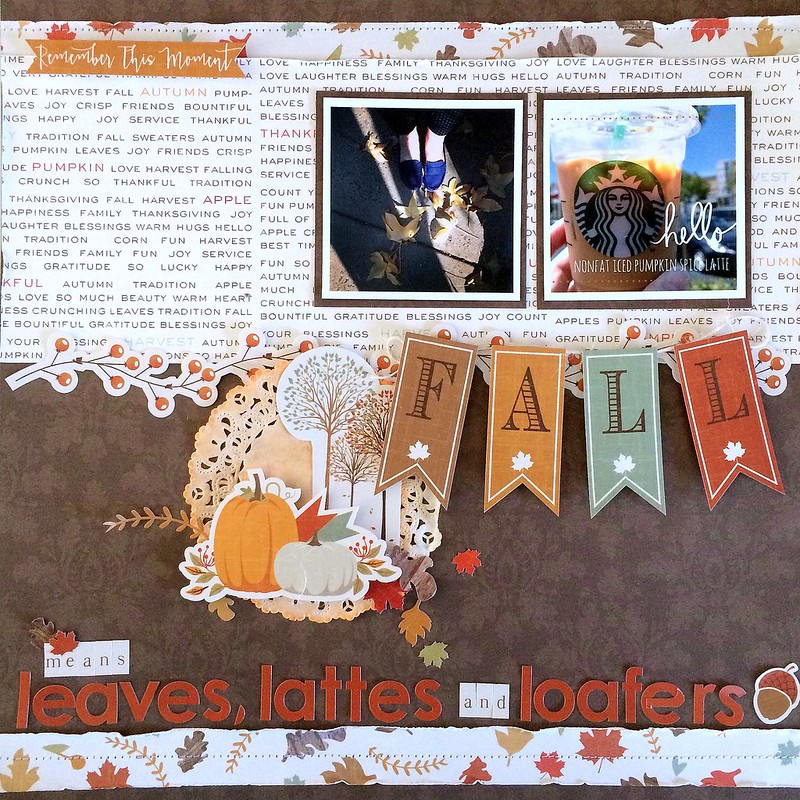
Happy Thursday!  Lisa here today to bring you a layout I created for our Monday Recipe Challenge in the Forum. We would love to see you participating in these fun challenges, not only will you get pages done, but you could win prizes!!  This week's recipe challenge is:

To create your page, you must do all of the following:
F-Fall Means to me....(what does Fall mean to you?  This is the subject of your page)
A-Any Fall Themed Paper
L-Leaves
L-Long Title

I used the SO CUTE PhotoPlay Paper Autumn Day collection for my layout...

Fall Means- PhotoPlay Paper by Lisa, on Flickr

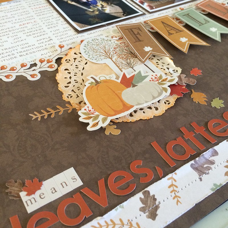
and a close up...

Fall Means- PhotoPlay Paper by Lisa, on Flickr

Can't wait to see what Fall means to you!!!

Read more: http://myscrapsandmore.proboards.com/thread/13377/monday-recipe-challenge-14-15#ixzz3lTl1DI6D